Customer Success Stories

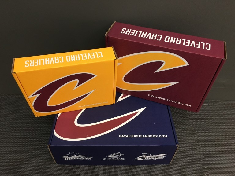
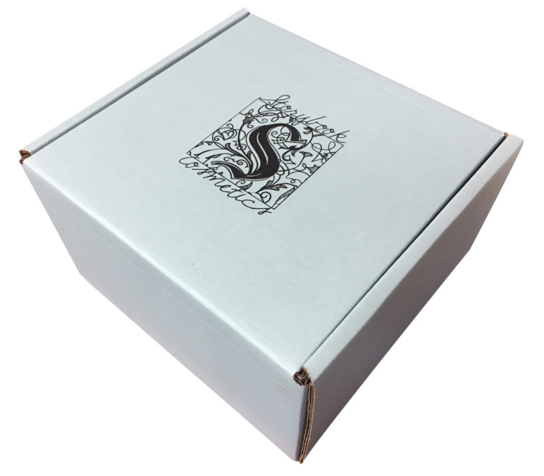
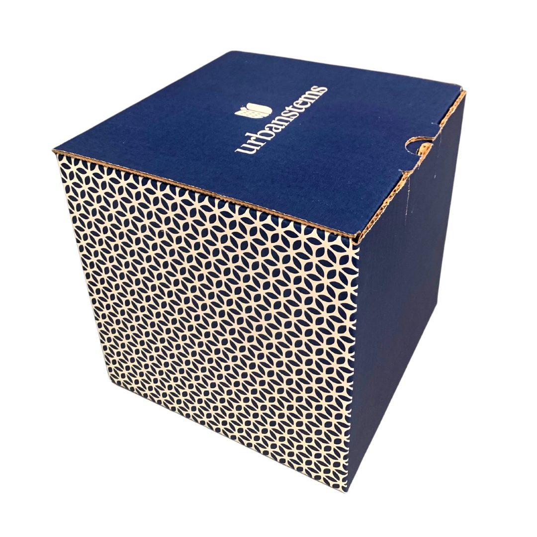
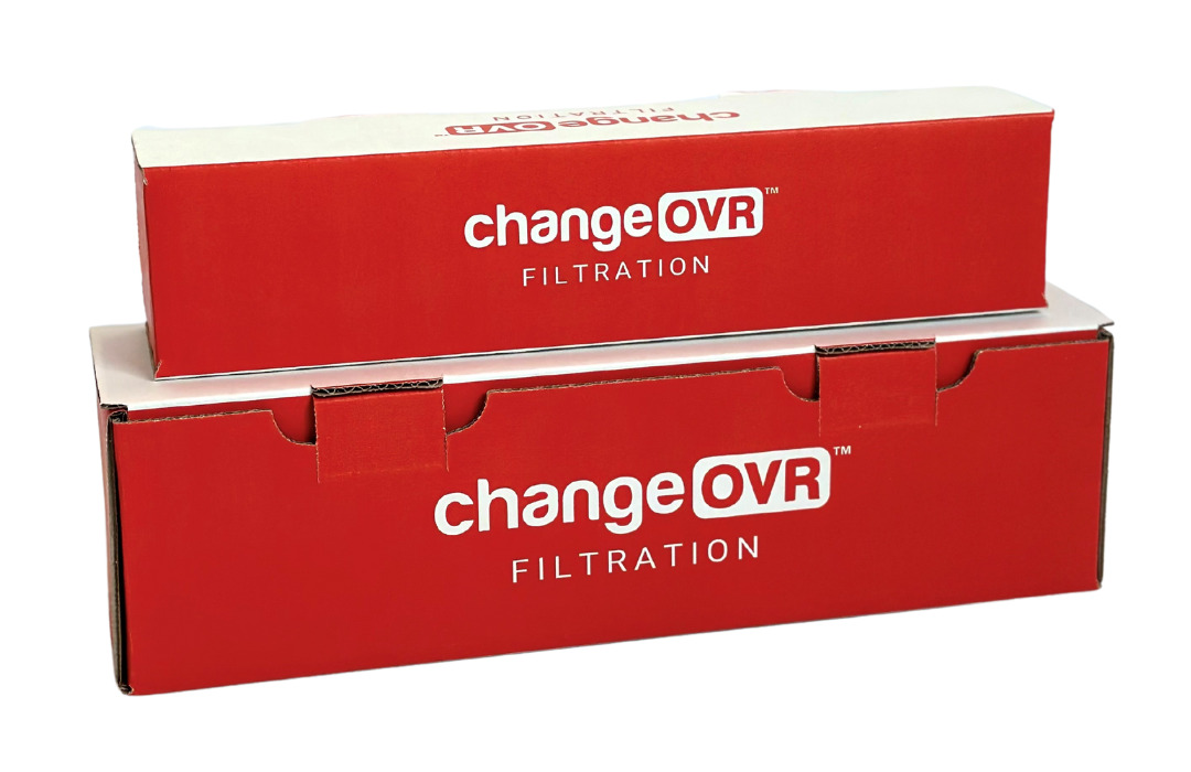
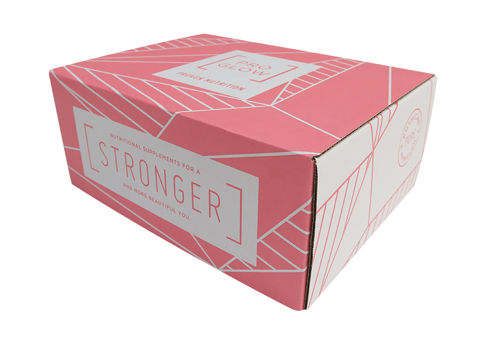
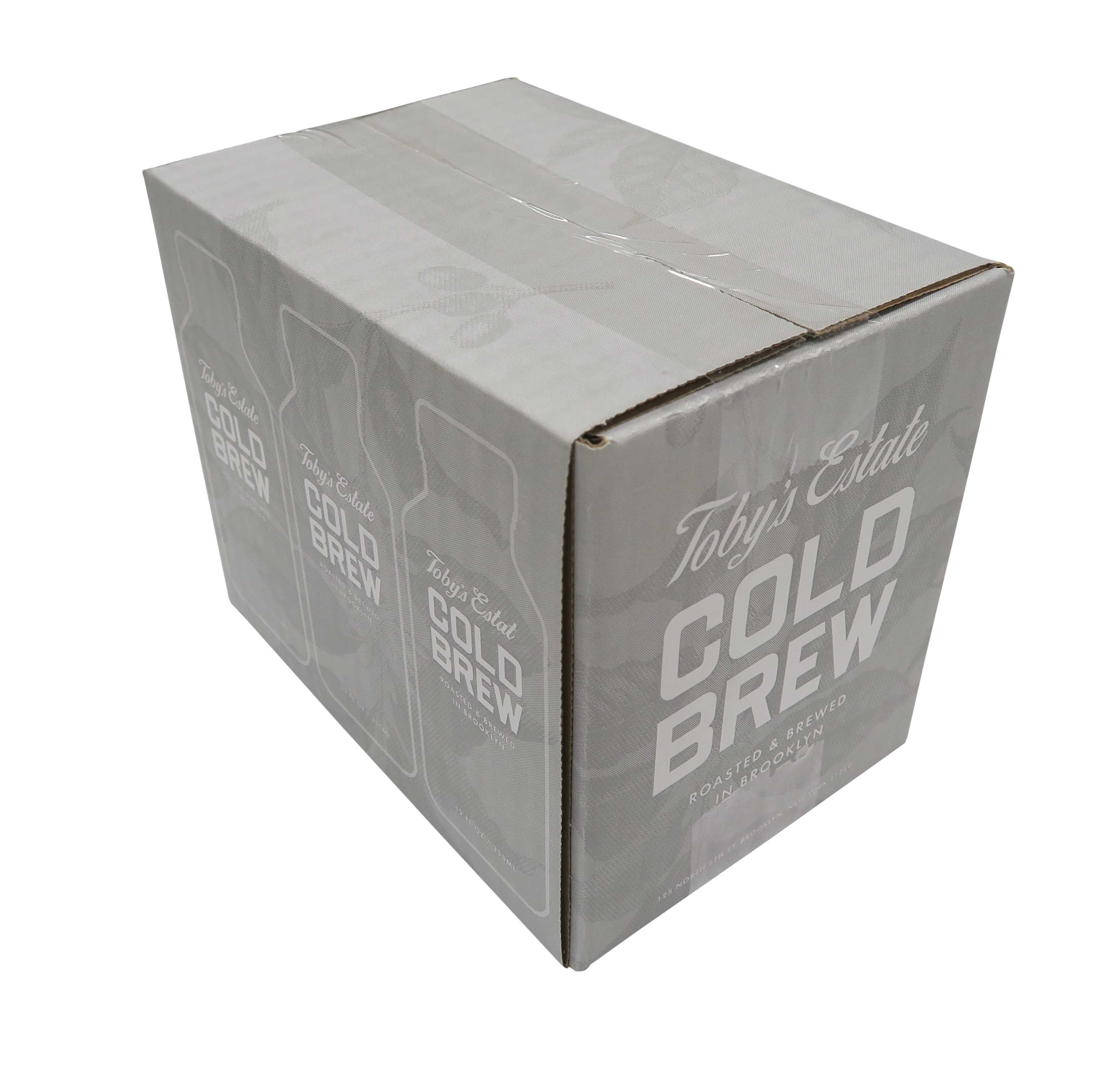
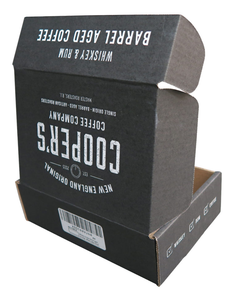
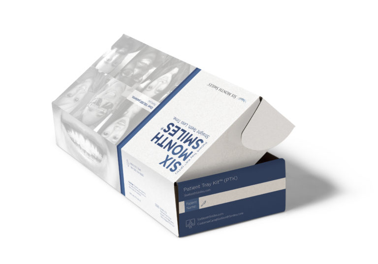
Check out these examples of the work Custom Boxes Now has done for our clients! Learn about what troubles we faced for each client and how we overcame them in order to provide the perfect custom box to fit their needs! You can view more examples of our work here.

proglow

Proglow

Objective

  • Create secure, beautiful, engaging packaging for Proglow’s partnership with We Are Charlette 
  • Develop a symbolic box using a strong, clean and classic look representing and promoting “a more beautiful you.”

What We Did

  • Used the classic flexo printing to design and print a simple yet elegant 1-color flexo printed C-series box.
  • To give the boxes a soft and feminine feel in respect to their female founder and creator, we used a unique, eye-catching pink pallet.

View This Success Story

hugh & crye

Hugh & Crye

Objective

  • Design a custom box to represent the quality and professionalism of the Hugh & Crye brand.
  • Give Hugh & Crye confidence that they will offer the best experience for customers at every stage of the purchase process.

What We Did?

  • Created boxes to which Hugh & Crye explained “these are boxes that we’re excited to ship our products in.”
  • Used simplicity on the boxes with clean lines and minimal design to enhance the professionalism the company was hoping to represent.
  • Developed a self-locking box so that it would withhold unsteady conditions during the shipping process.

View This Success Story

hugh & crye

Toby’s Estate Coffee

Objective 

  • Design a box that would appeal to both Toby’s Estate and their customers to promote the brand at every step of the delivery process.
  • Give Toby’s customers a way to drink their coffee without going into the shop with a custom box to represent their high-end roast. 

What We Did?

  • Worked with graphic designers to create a one-color box featuring half-tone background images direct printed on all four sides.
  • Designed a regular slotted container box to ensure the coffee stayed in place.

View This Success Story

storybook cosmetics

Storybook Cosmetics

Objective

  • Create packaging that would nail the difficult balancing act between the branding of Storybook Cosmetics and the more general theme of fairytales themselves. 
  • Bring the packaging and design to life with representation of the beginning of a fairytale when customers open the box.

What We Did?

  • Used a calligraphy-based design to represent the scripted scrolling elements that starts so many classic fairytales along with flowers and leaves surrounding the lettering.
  • Used flexographic printing to give the effect of a hand-drawn, tale-as-old-as-time look to the boxes.
  • Created an easy-to-use design with a c-series self-locking box that was sturdy and could protect the products inside through the shipping process.

View This Success Story

storybook cosmetics
coopers coffee

Cooper’s Coffee

Objective

  • Create a box that is durable, on-brand, and that would get Cooper’s customers excited about what was inside.
  • Develop a classic look and keep with their brand identity. 

What We Did?

  • Used Cooper’s classic black and white colors with the logo right across the top of the box so that customers knew exactly what was coming. 
  • Created a strong box with folded inserts to combine clean lines with convenience.
  • Delivered the order of 3,000 units to the customer within a week.

View This Success Story

urban stems

Urban Stems

Objective

  • Create packaging that is in line with all of Urban Stem’s values as a company
  • Develop a box design that would keep the flowers in full bloom when arriving to customers.

What We Did?

  • Created a sleek blue box with a pinwheel design on the side to give a natural, romantic feel that looked genuine instead of cheesy.
  • Made sure the box was durable without being too heavy, easy to open, and that protected the flowers. 
  • Designed multiple shaped and sized boxes to make the perfect fit for their several different types of bouquets.

View This Success Story

urban stems
six month smiles

Six Month Smiles

Objective

  • Give the boxes a sleek, professional look to match the high-end results the company offers. 
  • Create a box that will excite customers as well as be as great marketing piece for the brand. 

What We Did?

  • Used a litho print on the boxes to meet the needs of a clean, crisp look the company was hoping for.
  • Used white on the interior of the boxes to symbolize the white teeth and get the patients and the dentists excited about the results. On the exterior, we included Six Month Smiles’ social account handles so happy customers could connect and easily share their results.
  • Created an easy-to-open box with clearly labeled custom inserts to hold their product.

View This Success Story

datebox

Datebox

Objective 

  • Create a box that won’t give away any secrets about what is inside.
  • Ensure the boxes look festive, elegant and most of all, fun for the customers. 

What We Did?

  • Created a box with a light teal shade with a pattern of interlocked spirals and swirls with the lettering written in simple, clean white block lettering to give an elegant and fun look. 
  • Developed a holiday box with white and gold coloring to get customers in the holiday spirit.

View This Success story

datebox
room dividers now

Room Dividers Now

Objective 

  • Create packaging that would match the integrity, quality, and attention to customer service of their company and products. 
  • Develop of a variety of box sizes and styles to fit the variety of shapes and sizes they offer. 

What We Did?

  •  Created five different box styles and sizes for the company.
  •  Used a crisp white box with bright blue and gray colors as a design to give the packaging a high-end look and allow the build of brand recognition.

View This Success Story