The digital age has witnessed massive growth in e-commerce as more people turn to the internet for fast and convenient shopping experiences. In 2024 alone, global retail e-commerce sales were expected to surpass $4.1 trillion, and that trend is not stopping. The explosion of e-commerce directly affects product shipping, making packaging more important than ever.
Merchants worldwide have the opportunity to stand out by prioritizing packaging. Well-thought-out packaging offers product protection, design aesthetics and brand awareness. It enables the first physical interaction between a brand and its audience.
Convinced that premium, custom packaging may be a smart move for your brand? Learn how Custom Boxes Now can help you make the switch to a smarter, custom box that will help you improve profits and make the sale. Here’s how to make a custom box for shipping:
Choosing a box style may seem overwhelming with so many options available. However, the following breakdown makes it easy to create a shipping box from scratch:
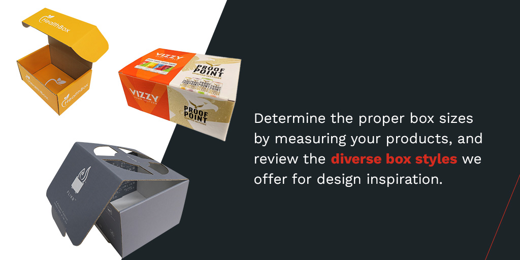
Your products influence the size and design of the packaging. Determine the proper box sizes by measuring your products, and review the diverse box styles we offer for design inspiration. Our process makes it easy and convenient to make custom boxes that meet your design and size preferences.
We are experts in structural design, ensuring your packaging has the ideal configuration, strength and stability. While we don’t provide graphic design, which involves preparing artwork for printing, we are experts in prepress and will optimize your personal artwork for high-quality printing.
Strength is a critical aspect of packaging that ensures products reach consumers in perfect condition. Like size, the strength of your box is determined by the product or products you are shipping. The heavier, bulkier or more fragile the items are, the stronger the box should be. Decide on three strength options — standard, strong or extra strong with a double wall.
Your well-thought-out art or branding graphics need exceptional printing solutions to stand out from the competition. Custom Boxes Now offers various options, from printing methods to image adjustments. You can choose from printing methods such as:
With our flexible processes, you can submit your order and receive your desired shipping boxes once you’ve decided on box preferences and printing options.
In addition to simplifying the process of creating custom boxes, Custom Boxes Now has over 60 years of experience as a retail packaging industry leader. During these decades, we have fine-tuned our experience in designing and manufacturing custom-printed shipping boxes. Today, we’re known for an on-time record of over 99%, helping our clients keep up with their packaging needs without productivity breaks.
How do we consistently meet our clients’ time demands? Our reliability is largely due to our entirely in-house process. Custom Boxes Now operates under one roof, based in Minneapolis, Minnesota. Every stage of the process happens in our facility — which lets us maintain total oversight over the details, quality and speed of each custom-size shipping box. As an ISO 9001:2015-certified company, our quality standard speaks for itself.
Our turnkey process includes a variety of versatile printing options depending on your company’s packaging preferences. If you decide to opt for custom shipping boxes with a company logo, for example, we can handle your printing needs in-house. We’ll only encourage you to get the services you need. We know you have a budget to meet, so we aim to offer the most cost-effective packaging plans possible.
When you work with Custom Boxes Now for your packaging solutions, you can enjoy benefits such as:
It’s easy to cut boxes and fold them into packages that fit your products. But when you consider the value of thoughtful packaging to consumers and its impact on your brand and bottom line, it becomes necessary to seek high-quality custom packaging from industry experts.
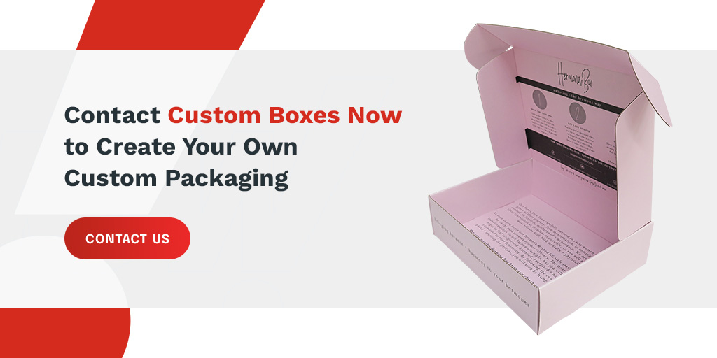
We make it easy to order fully customized packaging that reflects your brand. Still have questions about the process? Contact Custom Boxes Now for step-by-step guidance on creating your custom packaging.